Monitoring with counters
Creating a Netdata monitor for a queueing system using a simple API that returns counts of events.
A simple packaging system
Recently we’ve had a number of issues with Nexus’ support of RPM repositories:
- There is no progress report for generating metadata
- The RPM is uploaded/deleted prior to metadata generation - so the repository is often inconsistent to its metadata
- Broken RPMs can stall the metadata process until they are removed
- Metadata generation is inconsistent
- Metadata generation is slow
In Nexus’ defence we are building a lot of RPMs so the read/write ratio is very different to more common use cases. Additionally, all of these problems are in fact bugged and so will perhaps be solved in time.
However, these problems stem from Nexus using a reimplementation of the RPM createrepo tools and that Nexus does not have a staging area. So we looked at implementing a component store that:
- Used a staging area to ensure clean updates
- Use the native packaging tools (
createrepo,pep381run…) - Can be monitored easily
Our solution
- Docker containers to separate services and allow minimal “plugins” (for
createrepoand friends) - Monitoring via NetData
- File serving using NGINX
- Messaging using RabbitMQ
This creates a system with the following components:
- Upload watcher - watches the NGINX upload folder for new RPMs
- Stager - swaps between two staging areas, so download section is always consistent
- Plugin - runs the
createrepotool
Keeping things stateless with counters
We needed to measure the amount of time the createrepo tool is taking to construct
the metadata and the amount of time RPMs sit in the upload queue. However… currently
(aside from the filestore) the containers store no state, and we very much like it this way!
The solution we arrived at is to keep track of the arrival rates of RPMs into the queues:
| Counter | Value |
|---|---|
| Uploaded | 0 |
| Staged | 0 |
| Plugin | 0 |
| Processed | 0 |
| Complete | 0 |
This is done by creating a new queue called events that receives messages from any
of the stages when they change state. A simple service then keeps a count of all of
these events and is the only extra state in the system - and all in one place!
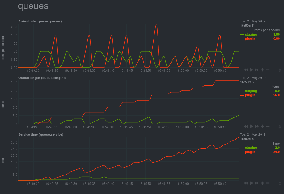
Queue lengths are simply the difference between these counters, so we can chart that over time:
In our system this is output through a Netdata dashboard, but this blog is using GoogleChart for examples.
What can we calculate?
The next thing to calculate is the rate at which items are entering each queue. Netdata
has a rather handy incremental graph style, so we can do this with no modifications. In
this example though we have to keep the previous state of the counters so we can find the
change per second:
OK, easy enough - but what about serving time?
Little’s theorem
The time taken to serve a request is given by Little’s theorem. There are a host of examples of this to be found - but the long and the short of the thing is this simple formula:
L = λ W or Length = Arrival Rate * Work time
The problem is that these values are average values over a window of time. If we just take the last two values we get a graph with really extreme values. No good to anyone:
Exponential Smoothing
Exponential smoothing is a technique to calculate a moving average for a dataset without the need to store multiple values. It has the advantage of being really simple:
sᵢ = α xᵢ + (1 - α) xᵢ₋₁
There is a fair bit of hand waving to be done to get a good value for α but a reasonable
rule of thumb we’ve found is that 1 / T where T is the amount of time under consideration
is reasonable. So we’re using 1 / 60 - meaning that after a minute we should be at 63% of
the “real” signal.
The really nice part here though is we’re using two smoothed values to calculate a result, so the smoothing cancels out in the first order term.
Putting this into netdata
This example is available on github. A new chart is added by simply pushing the files to the correct places in netdata installation and ensuring netdata has access:
FROM netdata/netdata

## Add information to netdata
COPY queue.chart.py /usr/libexec/netdata/python.d/
COPY queue.conf /usr/lib/netdata/conf.d/python.d/

## Ensure that ownership and python modules are present
RUN chown root:netdata \
        /usr/lib/netdata/conf.d/python.d/queue.conf \
        /usr/libexec/netdata/python.d/queue.chart.py \
        /usr/libexec/netdata/plugins.d/python.d.plugin
…and that is it:
Troubleshooting
Netdata, as much as I enjoy using it, does have a tedency to not show graphs for a variety of reasons and leave you wondering why you can’t see them.
- Service timeout
Use
autodetection_retry: 60(retry after one minute) and/ortimeout: 60(wait this long for the URL to come back) - Zero values If you can, make sure incremental values are not zero, even by chance. Netdata seems to take this as an error condition.
This Javascript code
The Javascript code for this page is not minified so you can browse how the graphs are put together.